This is the win that started this blog. It’s as massive as the headline seems, and even more lucrative.
Let’s break it down…
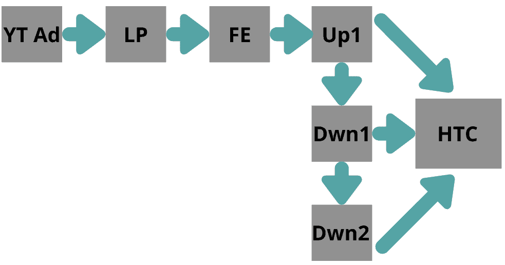
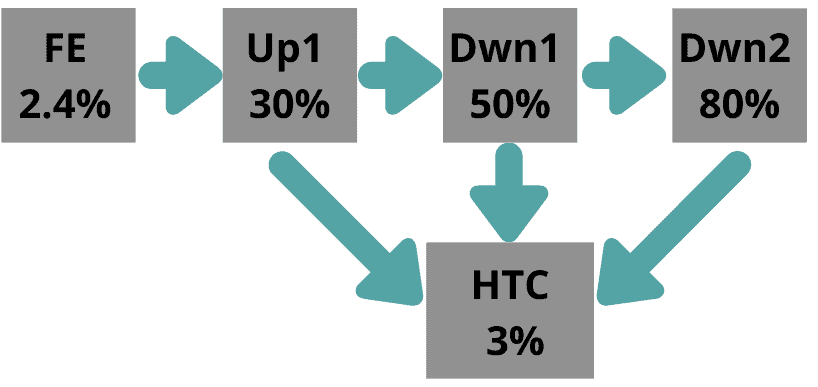
Funnel Overview
For those that don’t know, this funnel is doing around 1M/month on the front end, and 1M/month on the backend.
Essentially, the front end teaches phone closing for inbound leads. The upsell is a phone closing certification that gives you access to a job pool.
The high ticket backend coaching is private coaching to level-up your sales skills and get personally introduced to clients willing to pay big bucks for phone closers.
The entire funnel looks like this:
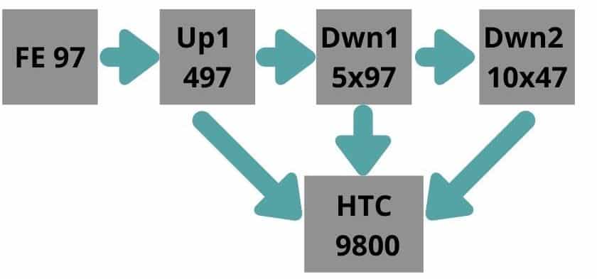
The pricing model looks like this:
And the conversion rate looks like this:
The Funnel Linchpin
Now to beat a control, it makes sense to focus on the front of the funnel rather than the back. Because everything has a trickle down effect. More customers = more money.
However, starting at the very top (i.e. the YouTube ads) doesn’t provide the biggest leverage in this case.
The YT ads ROAS are reliant on the CVR of the VSL. A higher CVR on the VSL means that even mediocre ads will have a better ROAS.
As such it makes sense to focus on the VSL for the biggest needle mover.
FE VSL Overview
Let’s just start off by saying this VSL is fucking awesome. It was written by Robert Bennet – one of the best copywriters I know of -and chiefed by the legendary Dan Ferrari.
It’s really no surprise that it converts 2.4% of COLD traffic.
This is the main reason I did not go after the copy first when “beating the control”. Frankly I was confident I would NOT beat it that way.
Hence, outside the box thinking.
The ONE Big Problem Of This VSL
So obviously, there’s more than one problem with any VSL. This one was just glaring IMO.
And as I pored over the Wistia day with my copy mentors Mike Abramov and Chris Wright, they agreed.
Here’s the problem:
Less than 10% of people we’re making it to the checkout page.
And with our checkout page converting at nearly 50% (which is unheard of), we were losing A LOT OF MONEY.
3 ways to optimize video engagement
There’s a few ways to do this.
First is simply improving the copy. More emotional stories, open loops, and punch in the gut sentiments.
This VSL was already full of this, and like I said, 2.4%.
The second is through audio and visual stimulation. Including B-roll, using music, different sounds, images flying, high quality A-roll.
This is something we will be testing in the future. But it’s high leverage. You need to shoot live footage and have really, really good video editors that either understand marketing, or have very specific directions from a copywriter. I believe this is a super important, but takes a while to implement.
Lastly, we can minimize distractions.
Minimizing distractions encompasses a lot of factors, but it’s main goals are:
- Make it easy for people stay on the page / VSL
- Make it super easy to click “buy now”, even if they are distracted.
And by focusing on this last one, we got a 110% lift.
The first 55% lift: Take Up More Page Real Estate
One of the biggest lessons I learned in 2020 was all about page real estate. Everything essential needs to go ABOVE the fold.
Resurge did 100MM in 2020, and a big reason was because of page real estate.
For a TSL, that means the eyebrow, headline, and subhead. Maybe some before and after’s too if they’re relevant.
But for the VSL, that pretty much means a headline and the VSL. And bigger videos win every single time (sometimes even without a headline).
See how everything above the fold is almost ALL VIDEO?
That’s how you MAXIMIZE page real estate.
The second 55% lift:: Add A CTA INSIDE The VSL
This is something I think will become mainstream as we are the first to do it (as far as I’m aware of).
Put simply, it’s adding a CTA INSIDE the VSL.
Not underneath. Literally, on the VSL screen.
Here’s a super short video of what that looks like:
I mean look at the size of that button?
Who the hell isn’t going to click it.
The result? 110% more people landed onto checkout page (9%–>20.8%)
Which means a lot more $$ in the bank.
The most important takeaway here, beyond the actual split test win, is this: UX matters.
Make it effortless for people to stay on the page. Minimize the opportunity for distractions. And make it really, really, stupidly easy to say yes and get onto the checkout page.
I can guarantee if you do that, you’ll beat the control every time.
P.s. A few tech God’s worked on this, but one in particular I’d like to give a special thanks to… Ryan Hunter, who started this whole thing. If you need an intro, hit me up, and I’ll make it happen. He’s a big reason why this thing went super smoothly and I highly recommended his services for all tech related projects.
P.p.s Also a special thanks to the king himself, Mike Heiser, for his ruthless leadership and tolerance of my risky ideas. It was his push for the in-video CTA that made this magic happen.