
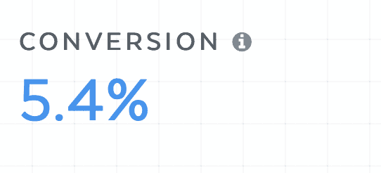
So let me paraphrase this post by saying that we started off with an atrocious sales page CVR base, as you can see below…
Here’s what happened…
In April 2021 we essentially broke clickfunnels and we had to move to a new platform.
Enter SamCart.
The only problem?
Customization was difficult, templates were screwed and Checkout page CVR went through the floor.
In fact, I have NEVER seen a checkout page convert so poorly…
So here’s what we did to get back to (somewhat) normal conversion rate…
Which btw also dropped our CPA by 50% in one week 🤑
Change #1: Adding A Countdown Timer
The first thing we did was add a countdown timer, like so. This was an idea first proposed by Alen Sultanic from Nothing Held Back (which you can join here: https://www.facebook.com/groups/nothingheldback/)
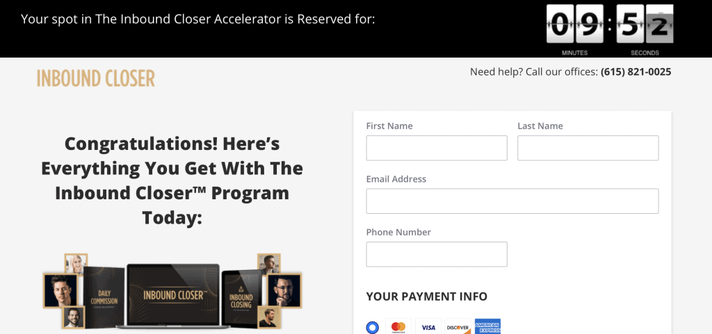
Here’s my thinking. The countdown timer adds scarcity. Sure it’s false scarcity, and I wouldn’t recommend it for a personal brand as it would reduce trust over time…
However for this cold traffic funnel, it works though. Really well, in fact.
Our checkout page went from 9.2% CVR to 11.5% CVR, nearly a 20% boost.
But that was just the beginning.
Change #2: Benefit Based CTA
The next test we decided to run was a CTA test.
I heard rumours that changing the CTA text from buy now to checkout had a massive 30% lift…
So we decided to test it. It bombed.
But that got me thinking, what if we made it a benefit based CTA, something the customer wants to achieve…
So we tested:
CTA 1: Checkout
CTA 2: Buy Now
CTA 3: I’m Ready To Quit My 9-5 Now
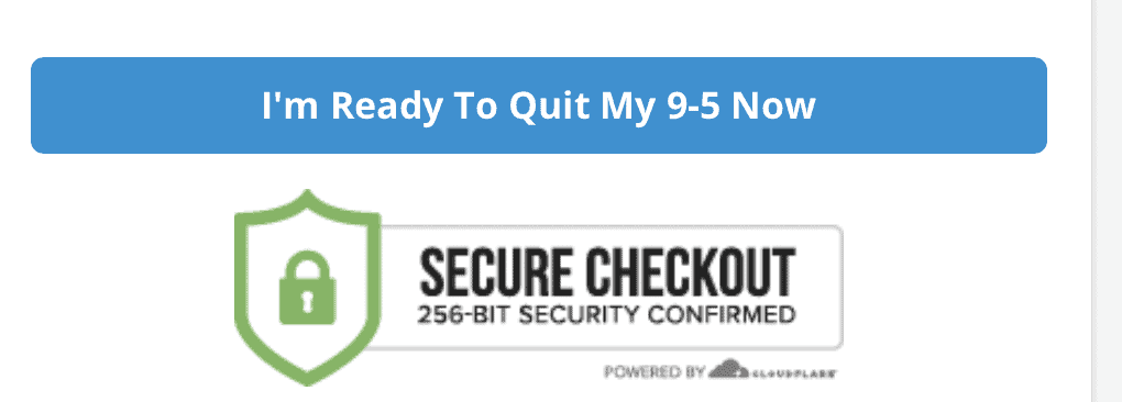
The results?
“I’m ready to quit my 9-5 now: beat the “checkout” CTA by 200% 🤯
Change #3: Scroll Based Exit Pop-Up With Discount
This is where the fun begins… because I’ve NEVER seen something like this in the direct marketing space – or any online marketing space for that matter.
When we first tested this, the idea was to just create an exit pop up discount on the checkout page if someone tried to leave.
The problem: On mobile it was hyper sensitive and would pop up too quickly. On desktop it was better, but still not super clean.
And the test results showed the same. It lost to the conversion.
But here’s the thing: 87% of our traffic comes from mobile. So we needed to make it work there first.
So instead we made the exit pop and action oriented event.
It would only fire if the user got to the fill out the information section and scrolled away.
Instead of describing it, it’s easier if I show you:
Video Analysis 🧐
As you can see in the video, if you scroll away but haven’t reached the form section, the exit pop up doesn’t fire.
But as soon as you get to that form, if you scroll away it’ll pop up.
The thinking is that, if someone has made it to the order form, they are pretty much ready to buy.
And if they’re scrolling away it’s probably a last minute price thing.
Which is why we offer the $10 discount.
It doesn’t hurt the AOV very much, and drastically increases conversions.
In fact, it was about 100% lift.
Together, They Gave Us A 320% Improvement In Less Than A Week
That’s going from 5.4% to 17.3%.
In other words…TRIPLING the amount of buying customer’s.
So if you aren’t using those 3 elements on your checkout page, it’s time to test them.
I can pretty much guarantee at least 1 of the 3 will give you a lift, if not all 3.
Just don’t forget to mail me a royalty check 😉
PT
P.s. Here’s our current live checkout page if you want to check it out…
https://checkout.inboundcloser.com/products/the-inbound-closer-accelerator/
We’re constantly running new tests so don’t be surprised if it looks different day to day!