Sometimes split testing is difficult.
Filming new VSL leads requires a lot of production, timing, and commitment.
You need to write the script, film the lead, ensure the spokesperson is on point, edit it, splice it into the existing VSL, then test it.
Other times, split testing is simple.
This is one of those times…
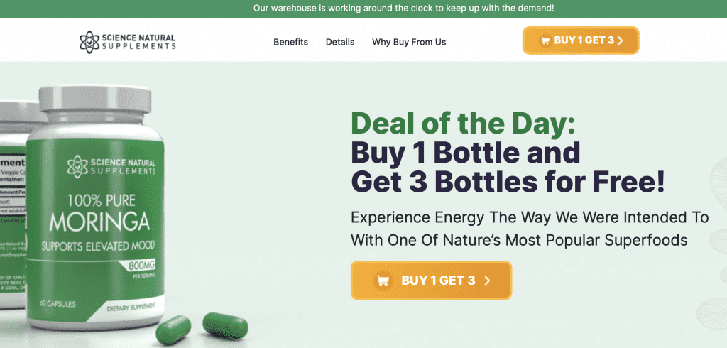
The original page

The winning page

What’s the difference?
I know, they look the same.
Same scarcity, same image, same headline, even the same call to action.
But if you look closer, you’ll see the design of the buy now box is different.
One is circular. One is square.
I’d love to say there’s some grand theory about why this would work…
But the truth is, it was a complete shot in the dark.
Blind luck.
But hey, if you step up to the plate and swing, you’re eventually going to hit something.
And sometimes you hit homeruns…
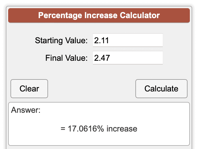
The Results: 2.11% → 2.47%
So yes the square button beat out the oval button by 0.36%.
Going from 2.11% → 2.47%
But it’s not 0.36% conversion increase, is it?
When we take a closer look, here’s what the data shows…

Yes…
That’s a 17% increase in conversion…
From changing a freaking button design.
No, I’m not fucking with you.
Sometimes making money is really this simple.
Pour Conclure
I’m a fan of big needle mover tests.
Price points, headlines, leads, etc.
But to really scale and dial in an offer, especially with where the world is heading…
You need to optimize everything…
And pull on every string you have.
Sometimes going for the grand slams, like new leads, is not always possible…
Sometimes, you need to get creative.
And realize that hitting a few single’s is often a better (and easier) option.
Sure it takes longer to see the real money come in (who wants that?)…
But ultimately, it can help dramatically stabilize a volatile offer.
This weird little test is proof of that.
Plus it’s an easy swipe for you guys to make more money 😉
Share it with your friends and business owners (and tag me if you’re on Facebook)
Until next time…
PT
